
I think it shows that they kinda nailed Ryo pretty good and that it's almost everything about lighting.
![]() by Verderame » Thu Aug 17, 2017 7:43 am
by Verderame » Thu Aug 17, 2017 7:43 am

![]() by mjq jazz bar » Thu Aug 17, 2017 7:46 am
by mjq jazz bar » Thu Aug 17, 2017 7:46 am


![]() by Hanzumon » Thu Aug 17, 2017 7:46 am
by Hanzumon » Thu Aug 17, 2017 7:46 am

![]() by Verderame » Thu Aug 17, 2017 8:02 am
by Verderame » Thu Aug 17, 2017 8:02 am

![]() by shredingskin » Thu Aug 17, 2017 8:04 am
by shredingskin » Thu Aug 17, 2017 8:04 am


![]() by mjq jazz bar » Thu Aug 17, 2017 8:05 am
by mjq jazz bar » Thu Aug 17, 2017 8:05 am
![]() by munchmunch » Thu Aug 17, 2017 8:10 am
by munchmunch » Thu Aug 17, 2017 8:10 am

![]() by Peter » Thu Aug 17, 2017 8:14 am
by Peter » Thu Aug 17, 2017 8:14 am


![]() by shredingskin » Thu Aug 17, 2017 8:17 am
by shredingskin » Thu Aug 17, 2017 8:17 am
![]() by Kiske » Thu Aug 17, 2017 8:23 am
by Kiske » Thu Aug 17, 2017 8:23 am


![]() by Peter » Thu Aug 17, 2017 8:29 am
by Peter » Thu Aug 17, 2017 8:29 am
![]() by jcjimher » Thu Aug 17, 2017 8:39 am
by jcjimher » Thu Aug 17, 2017 8:39 am
Peter wrote: Some explanations I've been kicking about for the logo.
1. Deep Silver have taken it upon themselves to design a placement logo as YSNET had decided to change the logo from the paraypus font to something else.
2. Deep Silver just drafted this up for the press release. Nothing more
3. The new logo we seen last month is going to be the logo on the backer copies only, and this Deep Silver logo is what's going to appear on the retail version.
Either way, this is technically the FOURTH logo used for Shenmue 3.
Yes, Shenmue III has updated its title logo. Taking your comments into consideration, Yu Suzuki and the team gave the title logo another hard look and decided to update the logo with this design.

![]() by Esppiral » Thu Aug 17, 2017 8:48 am
by Esppiral » Thu Aug 17, 2017 8:48 am
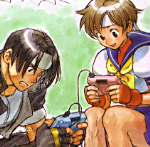
Verderame wrote: I think that this comparison that someone posted on Neogaf is actually pretty good:
I think it shows that they kinda nailed Ryo pretty good and that it's almost everything about lighting.


![]() by FlagshipFighter » Thu Aug 17, 2017 8:49 am
by FlagshipFighter » Thu Aug 17, 2017 8:49 am
Thanks you so much for finding this out, makes sense that they perhaps wanted to go with a more legible font (not bad for a first attempt, it looks a bit Greek-ish atm), but I'm super glad the backers are getting the OG font, that's a great move on whoever's part that made that decision, best of both worlds woooooohhh!Peter wrote:Some explanations I've been kicking about for the logo.
1. Deep Silver have taken it upon themselves to design a placement logo as YSNET had decided to change the logo from the paraypus font to something else.
2. Deep Silver just drafted this up for the press release. Nothing more
3. The new logo we seen last month is going to be the logo on the backer copies only, and this Deep Silver logo is what's going to appear on the retail version.
Either way, this is technically the FOURTH logo used for Shenmue 3.

![]() by shredingskin » Thu Aug 17, 2017 8:54 am
by shredingskin » Thu Aug 17, 2017 8:54 am
Users browsing this forum: No registered users and 1 guest
Powered by phpBB © 2000-