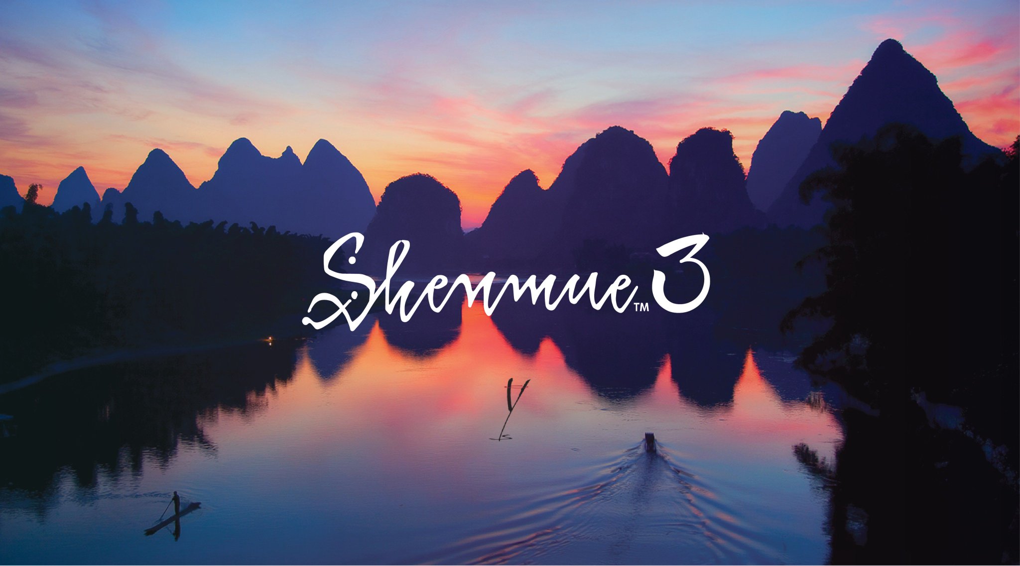
Psoted it on Twitter and got a like from Cedric Biscay too


 by FRASIER v3 » Tue Aug 16, 2016 11:27 am

by shengoro86 » Tue Aug 16, 2016 11:52 am

by BlueMue » Tue Aug 16, 2016 12:16 pm

by Yokosuka » Tue Aug 16, 2016 3:06 pm

by FRASIER v3 » Tue Aug 16, 2016 5:33 pm

by FRASIER v3 » Tue Aug 16, 2016 6:27 pm
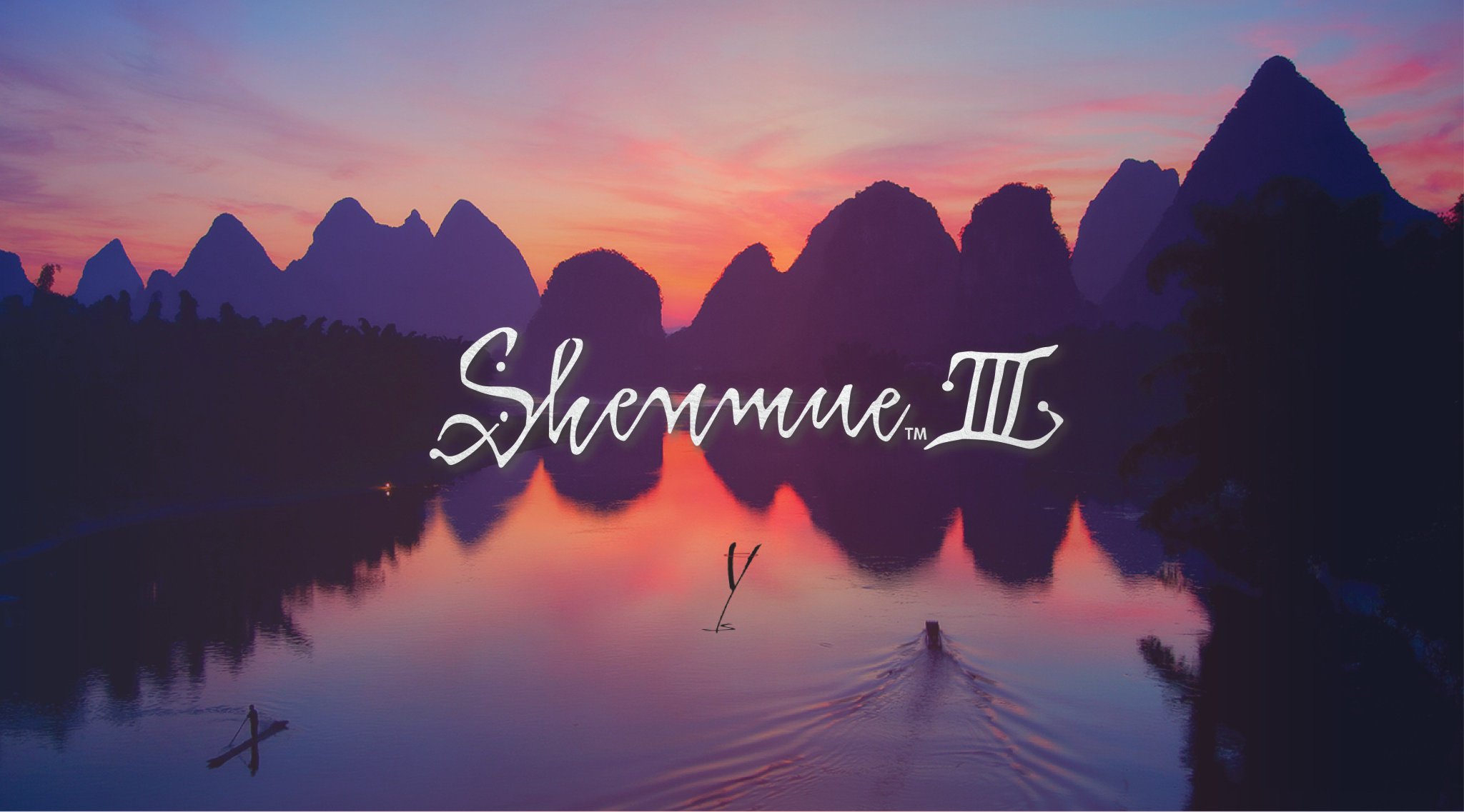

by south carmain » Wed Aug 17, 2016 2:12 am
Yokosuka wrote: I think it's the best Shenmue logo with Arabic number so far.


by FRASIER v3 » Wed Aug 17, 2016 5:23 am
by south carmain » Wed Aug 17, 2016 6:06 am
by south carmain » Wed Aug 17, 2016 6:13 am
by MiTT3NZ » Wed Aug 17, 2016 7:10 am

Users browsing this forum: Majestic-12 [Bot] and 1 guest
Powered by phpBB © 2000-